When you’re photographing, you’re constantly using contrast, through colors, lights, shapes, or textures, because contrast is just highlighting one element over another. Every time you do, whether you’re aware of it or not, include contrast in your images.
You’ve probably heard of the importance of choosing an approach for your photos so that they’re not flat or boring, right?, and the importance, once chosen, of guiding the viewer through the composition to him. naturally tends to orient themselves towards what emerges from an image. From a bunch of blue balls, in which there is only one yellow, the yellow one will come off the rest and therefore our gaze will be directed automatically.
- So.
- We can think of contrast as an additional composition tool.
- So it’s important that you learn to master it and consciously add it to your images.
To start using something, you first need to know a little more about the possibilities it offers you and, most importantly, where you can find it, fortunately you have contrast in everything, the most important thing is that it is you who wears it and that it does not end up in your image by chance. If you’re aware of the contrast, you can take advantage of other common elements to complement each other to highlight the approach.
Before we present contrast as the quality of the highlight of one element versus another; in color, this is equivalent to knowing and playing with complementary colors and harmony of tones, to achieve more or less contrast.
The maximum expression of contrast through color is given between complementary colors, which are opposites in the tonal circle.
On the contrary, if you move in a tone and its most immediate nuances (variations from the same tone), the contrast will be low.
If we want to show a little newborn foot, what do we do with it?Exactly, compare it to something much bigger. Look at the next image of the small foot in the hands of an adult, the same image without the contrast of size, would not allow us to get an idea of its small size.
This type of contrast is nothing more than opposite or very different situations, for example, a static element next to another in motion, the old and the new, wealth and poverty, etc. This type of contrast will allow you to add a lot of meaning to your images, even far beyond purely visual contrast.
Another very interesting way to add contrast to an image is the game of lights, an ad hoc illuminated object stands out much more than a homogeneous light image where everything has the same amount of light, playing with this type of image will not. they only give you visual contrast images, but many times this will allow you to add deeper meanings associated with light or its absence. There are two extreme techniques in the game of light and contrast with which you can train and you will surely not be disappointed. You probably already know them, don’t you?
You can read how to get one of the two keys in this article
At this point, you can predict the explanation now, can’t you?In fact, a contrast of shapes is obtained through two or more opposite or different shapes, for example, a turn in a square, a winding path in the riverbed next to a straight. Road, mountain tops and a flat valley? We also consider this whole combination of contrasting shapes.
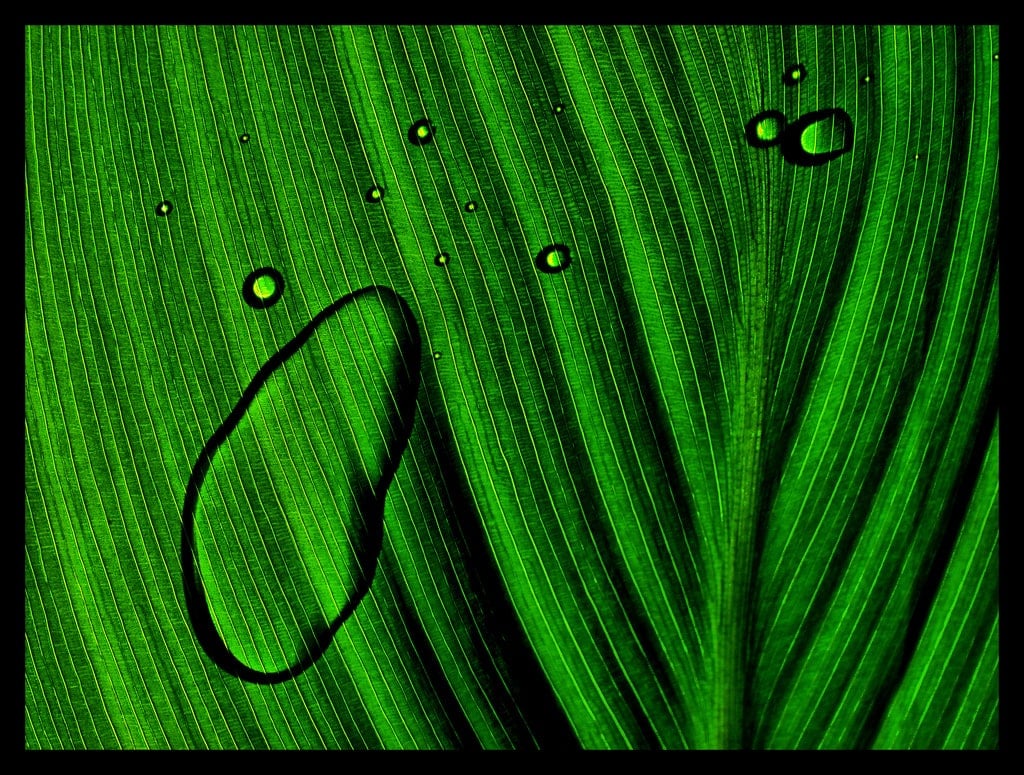
When we talk about textures we usually think of tree bark, wool, rocks or any element with a clearly identifiable texture, however, everything you can photograph has a texture, it can be smoother, thinner or softer or rougher, but everything has texture. It brings us closer to the image through the memory we have, allowing us to feel and imagine the touch of things through the image, so we always say that textures are an important part of the images, because they bring the viewer closer to your image and identify with it through this simple aspect.
Black-and-white images tolerate high contrast, ranging from an image composed of pure black and white as an expression of the highest degree of contrast, to the use of other shades of gray between the two. the grays are pure white or black, the lower contrast we will have in the image.
High-contrast images are images with greater visual strength and dramatic effect, while low-contrast images are smoother. Depending on the result you want to achieve you can choose between one or the other. Remember that textures are important, if you overexcite or underexposed, you will lose them. Unless you do it with artistic intent, it is important to display them correctly to preserve them.
Contrast is another way in which you have to force those who admire your image to go through it naturally, to mark the path as you want, as if it were an arrow. Contrast is a tool with infinite possibilities, both formally and in the amounts of meanings you can bring to your different images. So now that we’ve introduced you, integrate it as naturally as you did with so many other photographic concepts. I’ll tell you what, you know. what is the least cumbersome way to learn concepts? Pratiquez-les. If you had to learn to ride a bicycle through user manuals, theories of mass and space or the laws of gravity, how many people do you think will ride a bicycle today? Photography is like cycling, you have to practice it to learn it, don’t hesitate, and the best of all is that, like cycling, once you’ve really learned it, you don’t even have to think about it. you only dedicate yourself to enjoy it . .
And you know, if you liked it, did it help you, give you some idea for your new photo creations and/or do you think any of your friends or family, friends, neighbors, etc. could you be interested? Share it on Facebook, Twitter or Google (or all three at the same time) Thank you very much !?